upper waypoint

Drinking With Your Eyes: How Wine Labels Trick Us Into Buying

Save ArticleSave Article
Failed to save article

Please try again

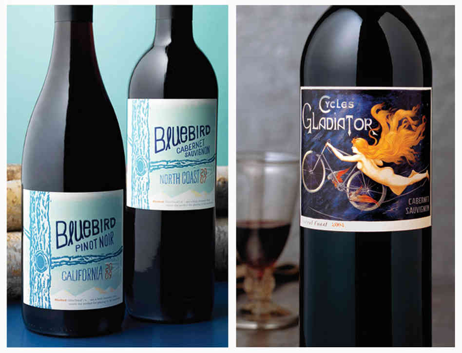
 Left: A hand-drawn typeface on Bluebird wines conveys a youthful, innovative feeling, while the puffy, raised lettering makes the $12.99 bottle appear more expensive. Right: When the Hahn family switched their cabernet sauvignon to this label, the wine started flying off the shelves — and its image of a naked lady helped get it banned in Alabama. Photo: Tucker & Hossler/Courtesy of CF Napa Brand Design
Left: A hand-drawn typeface on Bluebird wines conveys a youthful, innovative feeling, while the puffy, raised lettering makes the $12.99 bottle appear more expensive. Right: When the Hahn family switched their cabernet sauvignon to this label, the wine started flying off the shelves — and its image of a naked lady helped get it banned in Alabama.
Photo: Tucker & Hossler/Courtesy of CF Napa Brand Design

Post by Michaeleen Doucleff, The Salt at NPR Food (10/11/13)

We're all guilty of it. Even if we don't want to admit it, we've all been suckered into grabbing a bottle of wine off the grocery store shelf just because of what's on the label. Seriously, who can resist the "see no evil" monkeys on a bottle of Pinot Evil?

But the tricks that get us to buy a $9 bottle of chardonnay — or splurge on a $40 pinot noir — are way more sophisticated than putting a clever monkey on the front.

A carefully crafted label can make us think the bottle is way more expensive than it is, and it can boost our enjoyment of the wine itself, says David Schuemann of CF Napa Brand Design, who has been designing wine packaging for more than a decade.
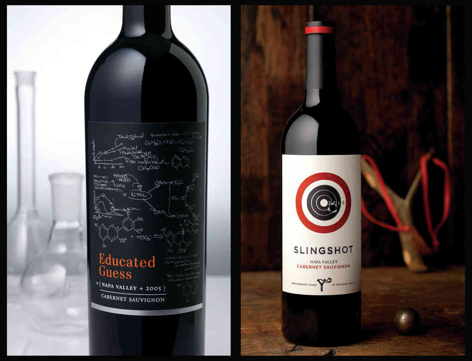
When a label goes for something whimsical, it must be clever, too - like these chemical reactions, which actually occur during fermentation. (Full disclosure: I have personally bought the wine on the left because I'm a sucker for chemistry that's correct.) At right: The label for Slingshot looks like someone actually used it for target practice. Photo: Tucker & Hossler/Courtesy of CF Napa Brand Design

In his new book 99 Bottles of Wine, Schuemann spills the industry's secrets about how wine labels tickle our subconscious and coerce us into grabbing a bottle off the shelf. The book is also a feast for the eyes, with about 100 photographs of the sleekest, most eye-catching wine labels in the business.
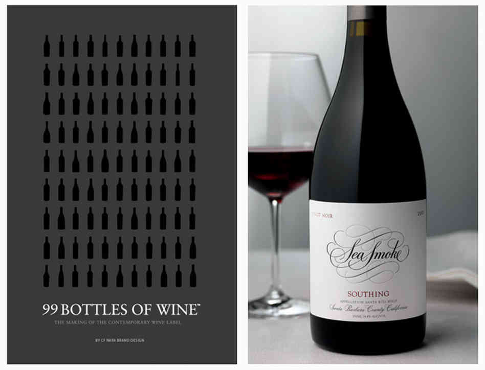
David Schuemann says he wrote <em>99 Bottles of Wine</em> as a "how to" for label makers. What's one of his favorites? Sea Smoke's pinot noir, which beautifully illustrates how a simple logo against a white background makes a wine look sophisticated and first class. Photo: Tucker & Hossler/Courtesy of CF Napa Brand Design
David Schuemann says he wrote 99 Bottles of Wine as a "how to" for label makers. What's one of his favorites? Sea Smoke's pinot noir, which beautifully illustrates how a simple logo against a white background makes a wine look sophisticated and first class. Photo: Tucker & Hossler/Courtesy of CF Napa Brand Design

"We always make a wine look about $10 more expensive than it is. So then it appears like an even better value," Schuemann tells The Salt. "We add gold foil to the label or a gold stamping. We emboss the label or add a third dimension to give it a rich texture or tactile feel."
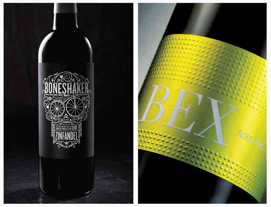
Hip and modern: The skull and bicycle gears on the Bone Shaker label speak to the hipster in all of us, while the clean, bold design of the BEX riesling sets it apart from other stodgy European labels and evokes the precision of German auto engineering. Photo: Tucker & Hossler/Courtesy of CF Napa Brand Design

In general, people associate minimalist, uncluttered designs with high-end vintages and sophisticated flavors, Schuemann says. "More expensive labels tend to have a cream or white background with a simple logo. Maybe a splash of gold or metal. But they don't have critters on them. Otherwise, experienced wine drinkers think it looks cheap."
Sponsored

But for less-accomplished oenophiles who are still experimenting with wine, the bottle needs to "pop" off the shelf more, Schuemann says. So his team makes the labels more colorful and louder for wines under $10. "They're whimsical in a clever way," he says. "And we'll still add a bit of gold foil to show the quality."

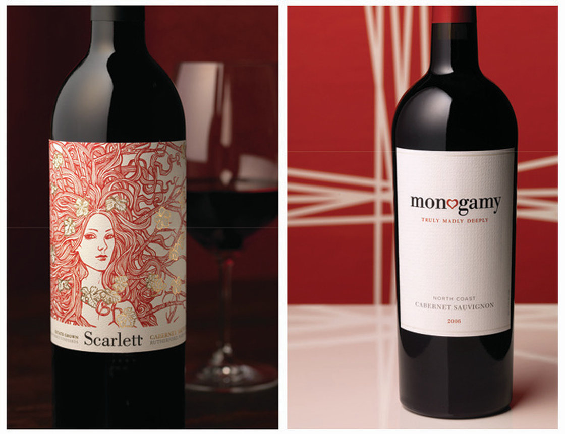
Shelf pop: Brilliant red ink and an arresting illustration make Scarlett stand out in a sea of Napa cabernet sauvignons. A splash of gold adds richness and elegance. Photo: Tucker & Hossler/Courtesy of CF Napa Brand Design

No part of the bottle is wasted for these subliminal mind tricks. Even that little piece of metal at the top of the bottle gets jazzed up with a fancy print, a sophisticated stripe or subtle sparkles. "Then people tend to perceive the wine as more expensive because so much care has gone into even the foil," he adds.

The foil's color on cheaper bottles helps beginners know what flavors to expect, Schuemann says. "A red foil communicates berries, while a green or yellow foil says buttery or tropical flavors are inside. Then the consumer says, 'Oh! That looks like it's going to taste good.' "

And that label can trick your tongue, too. "We've done some consumer research in which we poured the same wine for people, but from different bottles," he says. "The more they like the label, they more they like the wine."

Although Schuemann isn't a psychologist, there's some real scientific evidence to back up his ideas. A study several years ago found that when people think that they're drinking a $90 bottle, pleasure centers in the brain are more active than when they're sipping on a $5 wine — even when the two wines are actually identical.

And what about all those fancy descriptions on the back of bottles describing a chardonnay's buttery aroma and creamy mouth feel? They also work their magic on your mind, says Aradhna Krishna, a marketing professor at the University of Michigan.

"Eating and drinking isn't just about taste, but it's a combination of all our five senses — smell, touch, vision and even sounds," she says.

In one of her recent experiments, she and her team showed two groups of people ads for potato chips. "One ad focused on taste alone. But the other described how the chips smelled like BBQ and had a crunchy texture," she tells The Salt. The group that saw the second ad thought the chips tasted better because it evoked several senses.

The same goes for wine, Krishna says. "If the description on the back makes you imagine the wine's fruity bouquet and the way it feels in your mouth, then the taste will be enhanced and consumption goes up."

Who knows? You may even start salivating right there in the wine aisle.

Copyright 2013 NPR.

lower waypoint
next waypoint