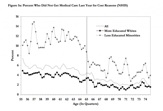
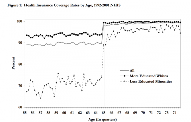
While we all wait to see if President Obama and House Speaker John Boehner will hash out a deal on the fiscal cliff, one item getting a lot of discussion is raising the Medicare eligibility age, as I wrote about on Friday. Today, I was checking out Sarah Kliff's twitter feed, and she pointed to UC Berkeley grad student Owen Zidar's blog. Zidar's post includes some eye-opening charts from economists David Card, Carlos Dobkin and Nicole Maestas writing in the American Economic Review.
Embedded in these wonky charts is an illustration of disparity:
And that disparity plays out in people not getting health care because of cost. Another snapshot of disparity:
 This data was compiled before the Affordable Care Act was passed. We'll have to wait and see how coverage and access change once the ACA is fully implemented in 2014.
