upper waypoint

'OK Google, Tell Me About 'Designed in California' at SFMOMA.'

Save ArticleSave Article
Failed to save article

Please try again

Charles and Ray Eames, ‘View From the People Wall,’ 1966 (still). (Courtesy Eames Office / Library of Congress)

If you visit the latest architecture and design exhibit at SFMOMA and begin to wonder if you accidentally stumbled into an electronics show, you’re probably in the right place.

To the left near the gallery entrance stands a large white Tesla Powerwall, bearing a prominent Tesla logo. On the adjacent shelf is a Google Nest thermostat and, above it, a 3DR Solo quadcopter drone with an attached camera.

Such tech devices — all Designed in California, the exhibit’s title — are a peculiar greeting to a show at an art museum. That’s partially because they’re all commercially available products, some of which are very new. Case in point: also near the entrance, under plexiglass and with title card, is a Google Home Mini, the tech giant’s virtual assistant unveiled for public sale just three months ago.

Google Home Mini, 2017.
Google Home Mini, 2017. (Courtesy Google)

Is this art? Even if it is, it also feels like SFMOMA is signaling something. Much has been made in the past five years about tech workers’ lack of engagement with the arts in the Bay Area, and specifically about tech companies’ apparent reluctance to support arts organizations financially. Every arts organization in the Bay Area has wondered, in boardrooms and annual reports, how to turn this around.

I won’t go so far as to say that Designed in California is an advertisement for tech — there’s more to the exhibit than the designs of Silicon Valley — but the three-month-old Google Home Mini, especially, feels like a signifier, a willingness to engage. (Were a curious CEO wondering how their company’s contribution might manifest at the museum, they’d need look no further than the large North Face tent prominently positioned in the center of the exhibit’s room. The North Face, visitors will note at the entrance, is a corporate sponsor of Designed in California.)
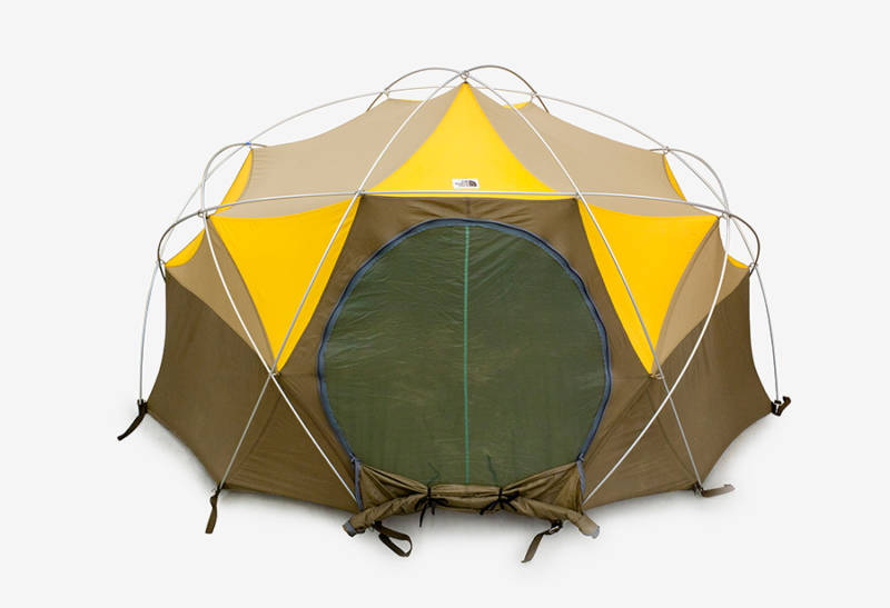
The North Face, Oval Intention tent, 1976.
The North Face, Oval Intention tent, 1976. (Don Ross)

What I will say is that Designed in California is a fun, jagged whisk through some of the state’s innovations of the past half-century. There is a fascinating through-line to be drawn from mid-century design concepts to the tech of today, but with a non-chronological layout, the exhibit leaves it largely up to the viewer to connect the dots between Ray and Charles Eames, the Ant Farm Collective, the Whole Earth Catalog and the 1973 how-to bible Nomadic Furniture on up to the tech devices of the 1980s and today.

Sponsored

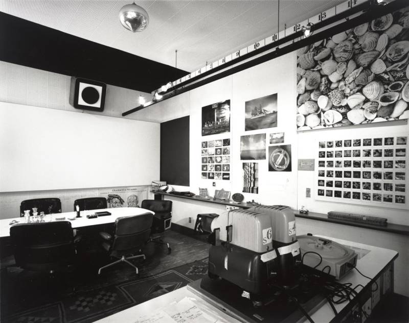
My advice is to start your visit diagonally opposite of the entrance, where a 1966 film by the Eames, commissioned by IBM, plays above a recreation of the Eames’ boardroom, a long table with walls busily decorated with prints of seashells, photos of ships and other errata. Vacuum tubes and a Super 8 camera linger nearby, with an intercom system that looks like it was assembled from a DIY Sears kit beneath a shelf.

Charles and Ray Eames, Eames Office conference room, 1944–89.
Charles and Ray Eames, Eames Office conference room, 1944–89. (Tom Bonner)

The film, View From the People Wall, is a delight. Screened through a viewer’s frame of shelving, on which sit old slide projectors, darkroom timers, mixers and reel-to-reel tape players, its editing is as aesthetically pleasing as any design in the show. More importantly, it’s a fantastic time capsule of an era when those creating code not only thought deeply about how to feed real-world problems into a computer (city planning, balancing a checkbook), but also bothered to explain to the public their reasons for doing so. There’s a wistful bygone feeling to IBM’s patient explanation, now, in the era of Facebook, Apple and Google secretly gaming algorithms and shrouding the private-information–gathering intentions of their global human experiment from its billions of test subjects.

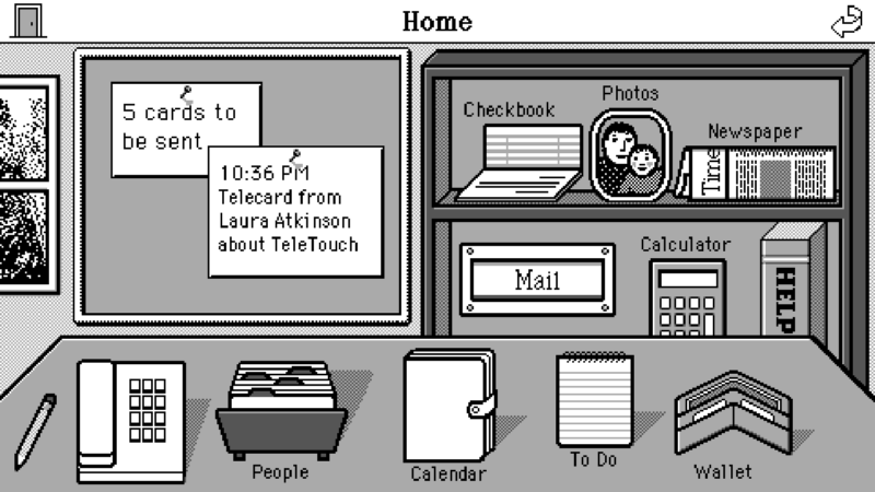
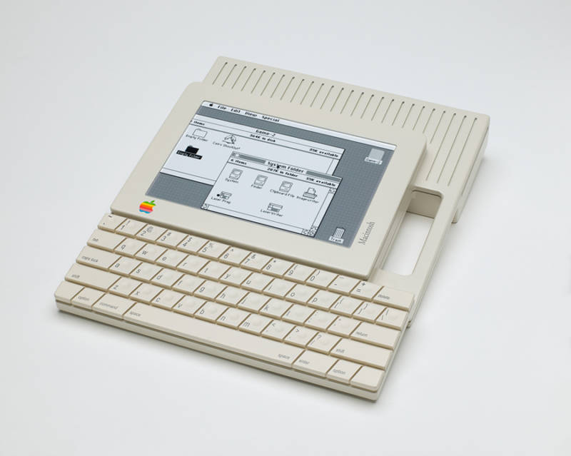
For a somewhat more innocent look at personal computing, one wall is dedicated to early prototypes: for Apple’s early mouse (1980), the Macintosh touchscreen tablet (1984), the NeXT Cube desktop computer (1986), the first iPod (2001). There’s an instantly fun familiarity here, especially in the work of Susan Kare, who designed early icons for Macintosh that we still use today.

Susan Kare, 'Sketch for Magic Cap graphical user interface,' c. 1992.
Susan Kare, ‘Sketch for Magic Cap graphical user interface,’ c. 1992. (Courtesy the designer)

But the connection between IBM’s concepts in the ’60s and Silicon Valley’s in the ’80s isn’t clear — that is, until one walks around the North Face’s Oval Intention tent (1976) to the opposite wall, where photos and materials from the Ant Farm collective and the Whole Earth catalog fill in pieces of the story. (Wooden furniture from the Baulines Craft Guild and dishware from Heath Ceramics stick out as worthy anomalies; products of California, yes, but famous as handcrafted objects and not design solutions.)

And where are we now, as Californians, in our relationship with design? A phrase on the cover of a pamphlet from the Farallones Design Group surfaces a hint: “Our theory is pretty simple,” it reads. “Change your surroundings and you change yourself.”

Hartmut Esslinger, Apple Macintosh touch-screen tablet prototype, 1984
Hartmut Esslinger, Apple Macintosh touch-screen tablet prototype, 1984. (Collection SFMOMA)

Designed in California shows that our surroundings have changed from building furniture from scrap material ourselves to ordering a mass-produced tent from REI through our wearable computer eyeglasses; from checking on our sleeping babies by feeling their foreheads and soft breath with our palms to monitoring their vital signs from across the hall on a downloadable app connected to their crib; from actively choosing a record to play by the crackle of the fireplace to asking that our wireless AI assistant execute an .mp3 file while digitally raising the room temperature.

Are we racing toward the future, or stumbling? According to Google Home Mini, “I’m not sure how to help you with that.”

‘Designed in California’ runs through May 27 at SFMOMA in San Francisco. For more information, click here.

lower waypoint
next waypoint