upper waypoint

Shapes, Shapes, Shapes! Harvey Quaytman Is Anything But Square

Save ArticleSave Article
Failed to save article

Please try again

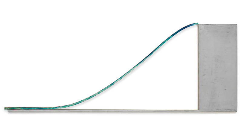
Harvey Quaytman, 'Jake's Gray,' 1969. (University of California, Berkeley Art Museum and Pacific Film Archive)

When I first read the title of Harvey Quaytman’s exhibition at the Berkeley Art Museum and Pacific Film Archive, I assumed the “static” of Against the Static was, because it followed an article, the noun form of the word: the buzz and crackle of signal disturbances.

Halfway through the late artist’s first museum retrospective, I realized I had it all wrong. Quaytman’s practice was about movement, curves and the (very) active process of making a painting in his own alchemical way. The “static” he rallied against in his four-decade long career as part of the downtown New York art scene was an adjective: the unmoving, still and sedentary descriptor.
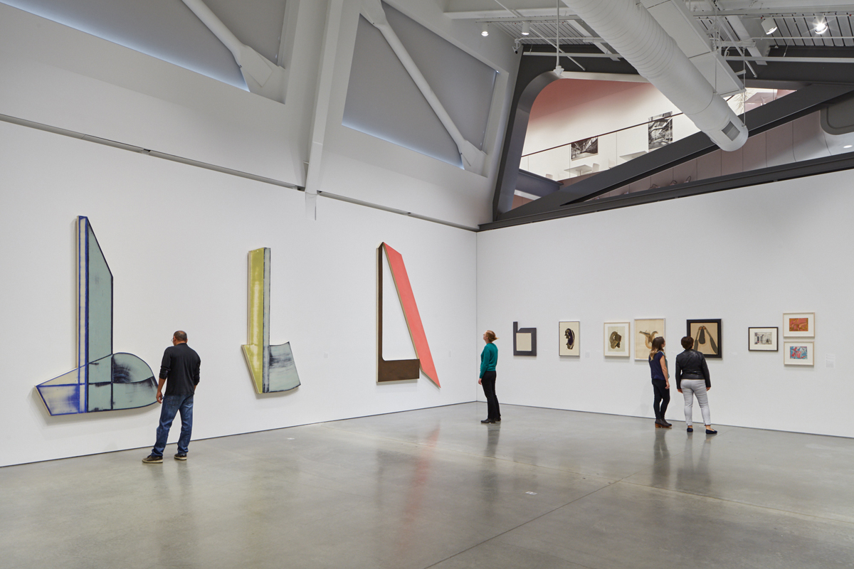
Installation view of 'Harvey Quaytman: Against he Static,' BAMPFA.
Installation view of ‘Harvey Quaytman: Against he Static,’ BAMPFA. (JKA Photography)

But then again, Quaytman loved language. In addition to wood, stretched canvas, acrylic paint, rare pigments and various chemical compounds, language was one of his materials. The titles of the paintings in Against the Static are filled with delightful puns, alliterations and half-rhymes. In that spirit, my initial confusion feels intentional and altogether appropriate.

And so a third understanding of the exhibition title opens up: Quaytman, under-recognized but incredibly prolific, painted against the static that was the noise of fads, movements, successes and failures in the 20th-century art world. The result is a body of work that patiently lumbers along its own trajectory, and an exhibition that reveals surprisingly fresh canvases around each corner.

Friends, colleagues, admirers and even museum directors use phrases like “artist’s artist” and “painter’s painter” to describe Quaytman. (This is code for “he didn’t sell a lot of work,” “he didn’t get the critical attention we think he deserved,” or both.) But these characterizations also make it sound like you have be an artist, or specifically a painter to appreciate Quaytman’s work. BAMPFA curator Apsara DiQuinzio organizes and annotates the exhibition to prove this is definitely not the case.
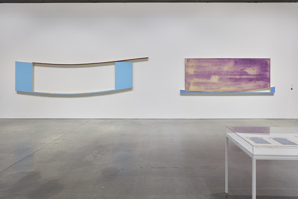
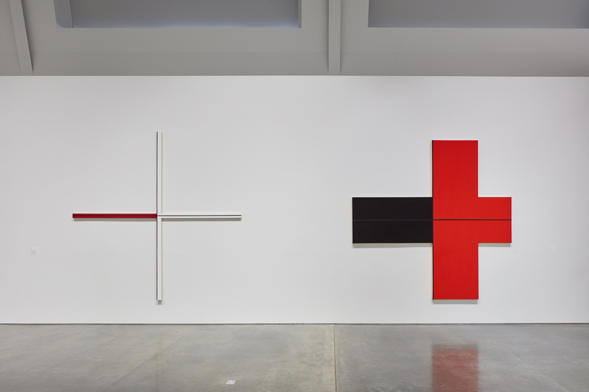
Harvey Quaytman, Left: 'Roadrunner,' 1970; Right: 'A Street Called Straight,' 1970.
Harvey Quaytman, Left: ‘Roadrunner,’ 1970; Right: ‘A Street Called Straight,’ 1970. (JKA Photography)

Quaytman’s career began in the early 1960s, heavily influenced by the colors and sinuous curves of abstract expressionists Arshile Gorky and Willem de Kooning. His rectangular canvases covered in swirls quickly turned into enormous curvilinear shapes inspired by Hebrew letters, Islamic calligraphy, airplane wings and the swing of a plumb bob. Pulling these paintings into object-hood even more, Quaytman poured acrylic resin medium directly onto the canvas surfaces, damming up the edges with aluminum tape and leaving behind crispy ridges.
Sponsored

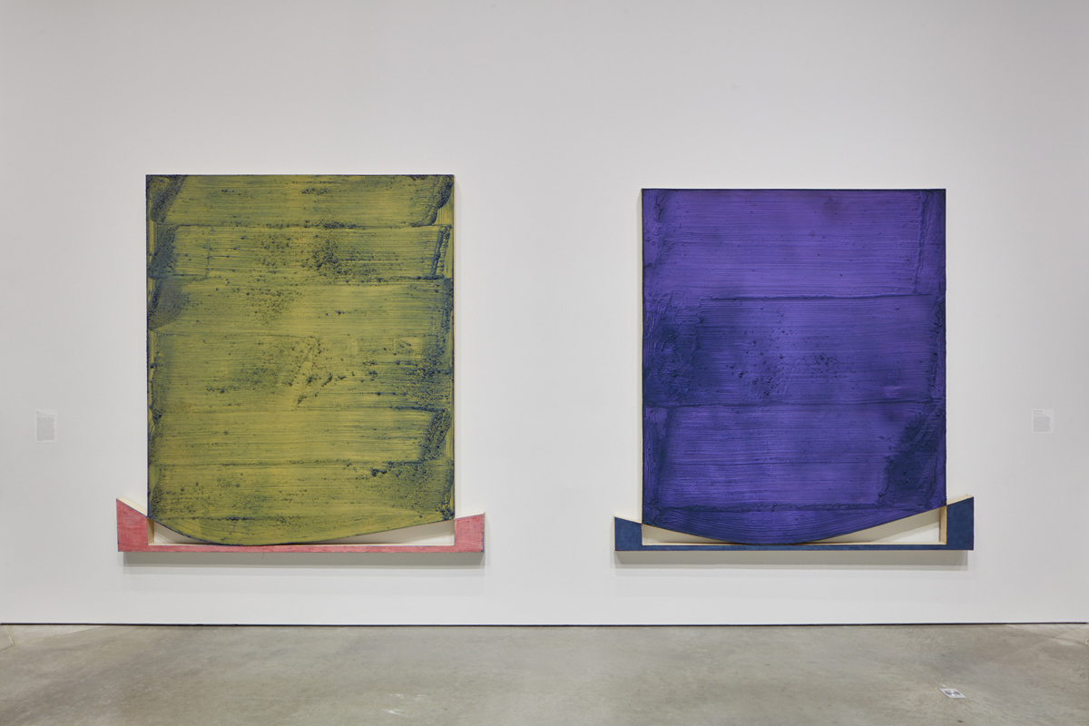
Surfaces became even more important in Quaytman’s series of “rocker” paintings, where shield-like top canvases sit delicately atop lower “bracket” canvases, creating negative spaces of gently sloping triangular ramps. Repeating these shapes over about 30 paintings, six of which are on view at BAMPFA, Quaytman focused on color and texture, pouring Rhoplex (a highly toxic acrylic adhesive) onto the canvas surface, sprinkling pure pigment over it and sweeping giant wallpaper brushes through the mixture. The results are geological. Clumps of pigment, swept to the edges of each canvas, fissure open like dried mud. Layers of colors create luminous, thrilling combinations; the series is a study in optical color mixing writ large.

Harvey Quaytman, Left: 'Araras,' 1973; Right: 'Sine Nomine Singer,' 1974.
Harvey Quaytman, Left: ‘Araras,’ 1973; Right: ‘Sine Nomine Singer,’ 1974.

Within Against the Static, Quaytman’s return to rectilinear canvases and, ultimately, the repeated shape of the cruciform, happens gradually. Curves get shallower, edges shore up, corners form right angles.

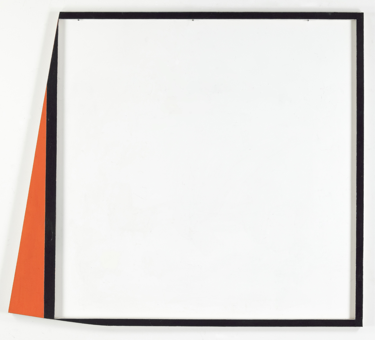
But the journey towards the repeated cross-shape that dominated the end of his career doesn’t happen without a few last hurrahs for complicated shapes. Vermillion Choir, a vertical rectangle with a horizontal rectangle knocked out of its center, resembles a mouth opened wide in song. The Gift, a mostly light pink painting outlined in black and olive, immediately calls to mind confetti cake. And Bordering Text, a thin black frame with a bright red wedge kicking out of its left side, reduces the painted surface to what look like stretcher bars, a precursor of the spindly cruciforms to come.

Harvey Quaytman, 'Bordering Text,' 1984.
Harvey Quaytman, ‘Bordering Text,’ 1984. (Courtesy of Van Doren Waxter, New York)

In Against the Static’s final galleries, there is nary a curve to be found. But the implied motion in those earlier slopes transfers now to the viewer’s eye. Varying glossy and matte surfaces, thick and thin lines, rusty textures with super smooth ones—all within the unflinching perpendicular format of a nondenominational cross—Quaytman did so much with seemingly so little.

To take it all in requires moving one’s eyes across each quadrant, shifting perspective to appreciate the glimmer of acrylic mixed with ground glass, and getting as close as the BAMPFA gallery attendants will allow to seek out specks of blue and orange among jet black.

Harvey Quaytman, Left: 'The Illusionist,' 1997; Right: 'Redwing,' 1997.
Harvey Quaytman, Left: ‘The Illusionist,’ 1997; Right: ‘Redwing,’ 1997. (JKA Photography)

Artists will get much out of Against the Static, especially painters (how to control for shape and color and texture and reflectiveness), but Quaytman’s career also speaks to striking out on one’s own, remaining dedicated to that task, and the possibility of extracting moral resonance from aesthetic decisions.

In a 1987 interview, he said, “If you are able to concentrate everything you believe into your work, then it’s ethically and socially valuable.” (Replace “work” with consumer choices, hiring decisions, philanthropic donations, or simply, allocations of time and energy.) And remember to fight against the static, however you define it.

‘Against the Static’ is on view at Berkeley Art Museum and Pacific Film Archive through Jan. 27, 2019. Details here.

lower waypoint
next waypoint