upper waypoint

BART's Fare Evasion Crackdown Exposes the 'Deadly Elegance' of Hostile Design

Save ArticleSave Article
Failed to save article

Please try again

BART's "inverted guillotine" gates to prevent fare-evasion have sparked backlash on social media as an egregious example of hostile design.  (Lina Blanco / KQED)

A city’s public architecture can tell you a lot about what it thinks of its citizens. Are the benches comfortable? Can I lay down here? Is there a place to sit while waiting for the bus? Urban planning provides tangible evidence of how a region grapples with some of its most pressing issues, whether that’s budget shortfalls or a crisis of livability.

Bay Area Rapid Transit is currently under fire for its pilot project aimed at preventing fare evaders from jumping through turnstiles with newly-installed modifications to gates at the Richmond and Fruitvale stations. The retrofitted gates, officially presented to BART’s board of directors as ‘Double-Decker’ and ‘Pop-Up’ modifications, have been derided as ‘skull-crushers‘ and ‘inverted guillotine’ gates by riders on Twitter.

“I haven’t seen anything that even comes close to the overt hostility of these inverted guillotine prototypes,” says Kurt Kohlstedt, digital director and producer for the architecture and design podcast 99% Invisible. “Usually they try to hide it better! I’ve encountered a lot of hostile design, but this one really takes the cake.”

In a viral tweet over the weekend, BART riders expressed their concerns over a recent fare-evasion modification pilot gate spotted at Fruitvale station. Many were quick to point out how the preventative effort is a disturbing example of anti-poor, anti-homeless and ableist design. Others called the prototypes an extreme example of hostile architecture.
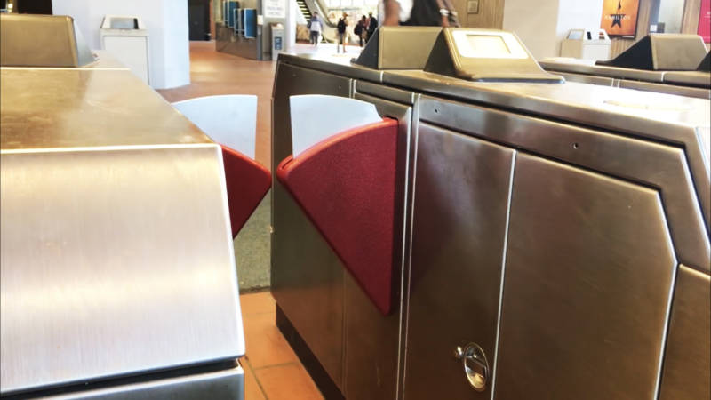
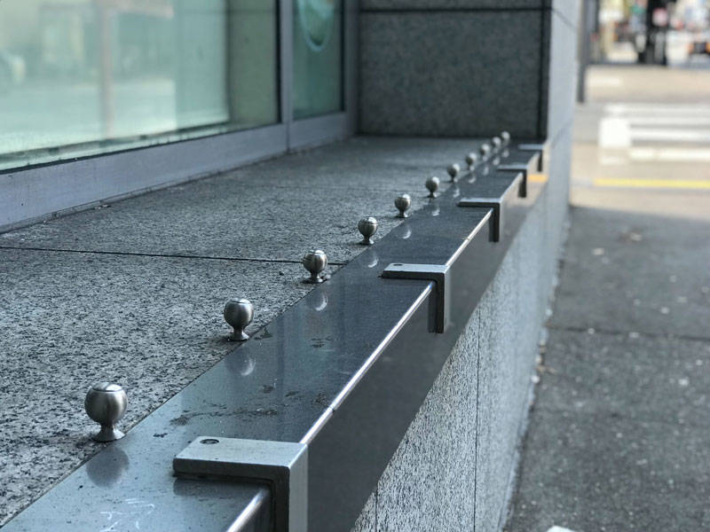
At its root, hostile or defensive architecture embodies the “anti.” Whether it’s anti-litter, anti-skating, anti-sitting, anti-loitering or anti-fare evading, the goal of hostile design is to prevent a person or group from taking specific actions, relying on an object’s mass, edges, weight, and other defining characteristics to alter behavior.

San Francisco is no stranger to hostile architecture and is often toted as one of the most unfriendly cities for low-income and homeless populations. “A lot of the design, in general, these days is creating an environment where people who are marginalized are not welcome,” says Kelley Cutler, human rights organizer at the Coalition on Homelessness.

Rocks, spikes, restrictive benches, loud music and barricades are all obvious examples of hostile design, but Kohlstedt explains it can also be camouflaged. Spikes are obvious, but boulders aren’t. Metal blades are egregious, but classical music blaring outside of an establishment isn’t. Restrictive barriers are overt, but the absence of park benches, water fountains and public restrooms isn’t. “Hostile design can be not just the presence of something, but the absence,” he adds.

At its worst, hostile design prevents society’s most vulnerable populations from finding sanctuary or rest, revealing a broader sentiment of how a city, landlords and residents feel and act towards unhoused communities.

Kohlstedt’s stories tackle both overt and discreet hostilities fashioned by urban planners and developers around the world, but there’s plenty of examples right here in the Bay Area.

A cafe on Larkin in the Tenderloin uses metal attachments to prevent people from sitting in an open windowsill. "Being aware of hostile design helps people know what their city is interested in doing," says Kurt Kohlstedt.
A cafe on Larkin in the Tenderloin uses metal attachments to prevent people from sitting in an open windowsill. “Being aware of hostile design helps people know what their city is interested in doing,” says Kurt Kohlstedt. (Lina Blanco / KQED)
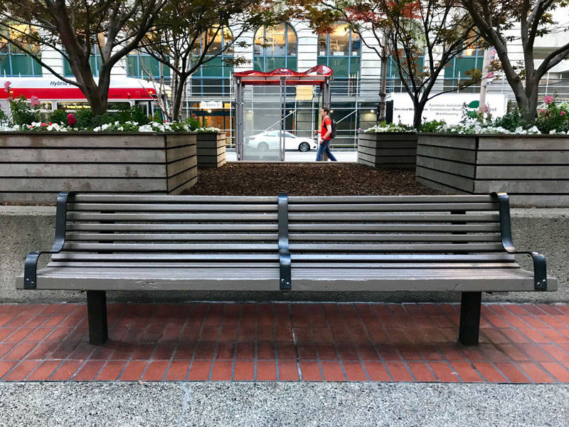
A park bench with armrests off Market Street near Embarcadero BART Station. Hostile design is motivated by preventing a person or group from taking specific actions.
A park bench with armrests off Market Street near Embarcadero BART Station. Hostile design is motivated by preventing a person or group from taking specific actions. (Lina Blanco / KQED)
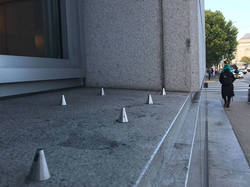
Spikes at the San Francisco courthouse that prevent people from sitting are an egregious example of hostile architecture.
Spikes at the San Francisco courthouse that prevent people from sitting are an egregious example of hostile architecture. (Lina Blanco / KQED)

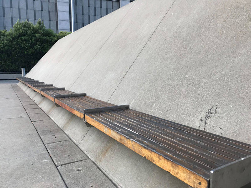
The plaza at the Phillip Burton Federal Building near Civic Center is a playground of hostile architecture.
The plaza at the Phillip Burton Federal Building near Civic Center is a playground of hostile architecture. (Lina Blanco / KQED)
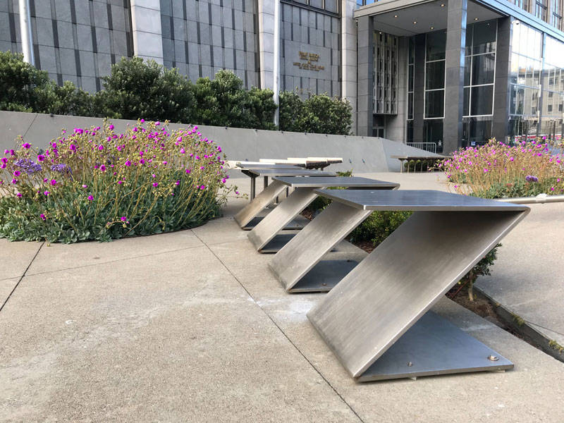
Don't let the flowers fool you. Angular steel stools installed on the plaza of Phillip Burton Federal Building prevent people from loitering.
Don’t let the flowers fool you. Angular steel stools installed on the plaza of Phillip Burton Federal Building prevent people from loitering. (Lina Blanco / KQED)

One of the more disturbing features of hostile urban design is its ability to camouflage its true purpose with aesthetics. Whimsical, modern benches with curvaceous lines might look inviting to a weary traveler, but they would never support a full night’s sleep. Similarly, armrests on a bench might seem like added comfort, not bars preventing anyone from laying down. Much of hostile architecture lives in a gray area, under the guise of a public amenity, but in practice functions as acts of aggression toward specific user groups.

BART engineers are tasked with a seemingly impossible design problem to prevent BART from losing $15 to $25 million in fare evasion within the confines of existing turnstile structures. Adding blades to turnstiles results in what Kohlstedt describes as a “deadly elegance.” At best, the patchwork hack might increase revenue by a few million dollars. Yet an underlying concern is that pilot programs like these could alienate riders from taking public transportation entirely.

When questioned about these concerns, BART Media Relations Manager James K. Allison shared that BART is currently participating in a 12-to-18 month means-based fare discount program starting in Fall 2019. The pilot program through the Metropolitan Transportation Commission would provide eligible low-income riders a 20-percent fare discount aimed at addressing larger issues of affordability. However, eligibility requires adults to submit documentation that proves income status or enrollment in low-income programs. Documentation of enrollment in low-income programs like Medi-Cal requires mailing addresses and working phone numbers, conditions that make it increasingly difficult for communities without stable housing to enroll.

In a statement, BART reiterated that their staff would never have installed pilot modifications if they believed these changes could potentially injure someone. BART maintains that no injuries have been reported at either Fruitvale or Richmond stations.

But riders and experts aren’t convinced.

“If there’s one positive thing I can say about them, it’s that they highlight just how hostile design can be,” says Kohlstedt. “Completely by accident and not by design at all, they’re proving to be a really good awareness-raising device.”

The old adage goes: Once you see it, you can’t unsee it. And maybe that’s the success of BART’s fare-evasion pilot program. “Being aware of hostile design helps people know what their city is interested in doing and the ability for them to decide if they agree with what their city is interested in doing,” adds Kohlstedt.

So next time you find yourself walking through your city, look around and see how many examples of hostile design you can find.

The results may surprise you.

This interactive map of San Francisco’s Hostile Design was produced by Heidi Loosen of UC Berkeley in partnership with the SF Coalition on Homelessness. 


Sponsored

Sponsored

lower waypoint
next waypoint