Last November, while the Camp Fire ripped through the town of Paradise, in Butte County, Bay Area residents 150 miles away choked on a thick layer of smoke carried southwest by the wind. For almost two straight weeks, San Franciscans, Oaklanders, and especially those living in the North Bay scrambled for N95 masks and air purifiers while experiencing some of the region’s worst air days on record.
Air Quality
Californians Turn to Low-Cost Sensors for Highly Local Air Quality Data
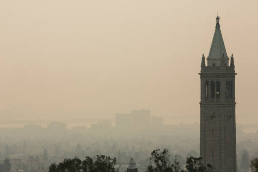
Smoke obscuring the view of San Francisco from the UC Berkeley campus during the Camp Fire. (J.P. Dobrin/KQED)
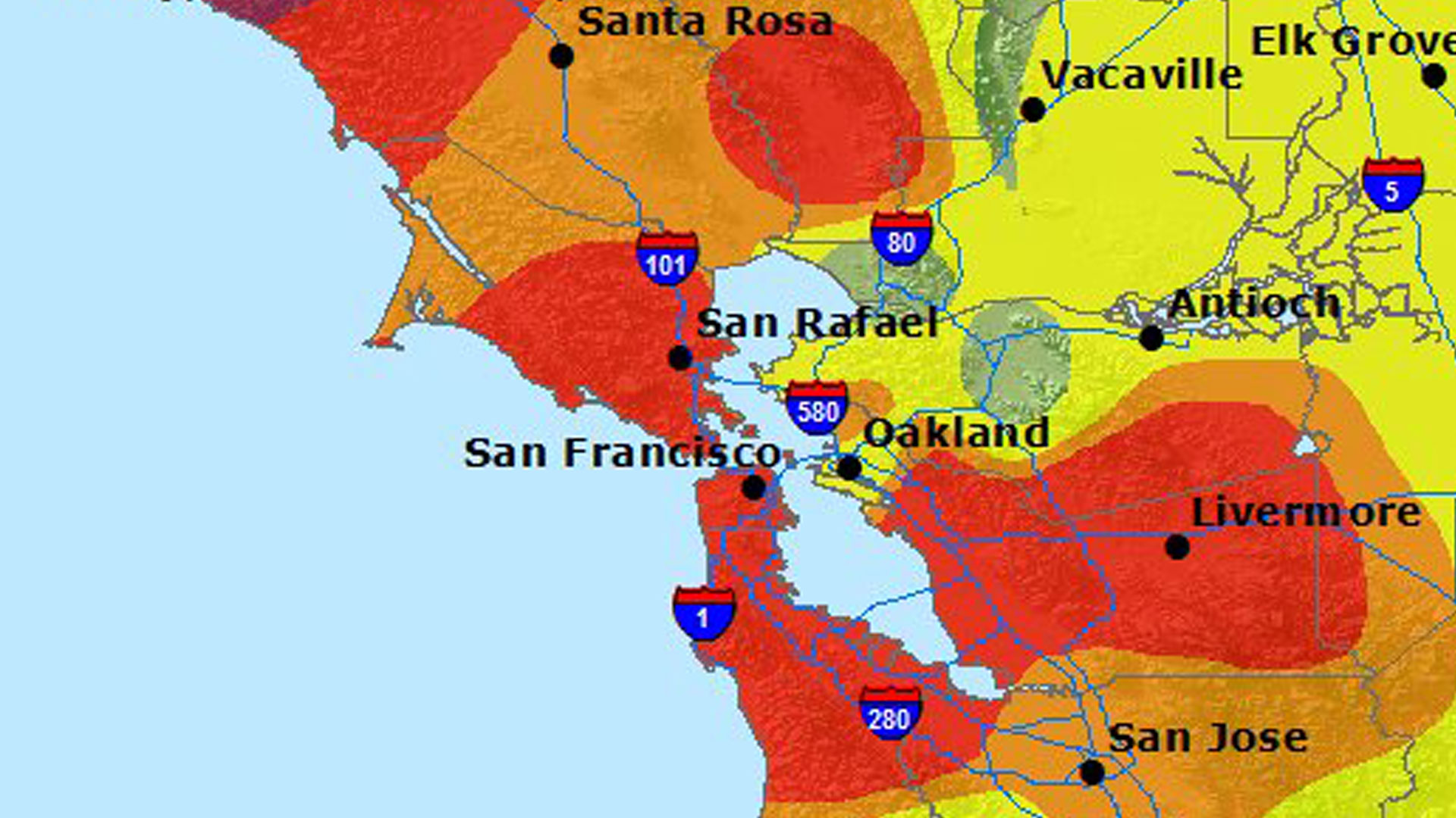
Besides getting geared up to protect themselves from the smoke, residents also flocked online to the Environmental Protection Agency’s color-coded air quality map to see just how the bad air really was, on an official level. During the Camp Fire, about 3.2 million people visited the site in a single week, causing it to crash. KQED Science also saw a tremendous influx of web traffic to its air quality map, which mirrors the EPA data. That surge in web visitors repeated during the worst days of the Kincade Fire.
Air Quality Data Proliferates
When the EPA site, called AirNow, went down, web users rushed to alternative, unofficial websites like the interactive, crowdsourced map maintained by PurpleAir, a manufacturer of low-cost air monitors. After AirNow crashed, PurpleAir immediately saw a 200-fold increase in web traffic, according to company founder Adrian Dybwad.
Sponsored
“People were using the network to try and find out how to escape the smoke,” he said. “It was a disaster and they needed to know where to go.”
The company also saw a surge in orders for its signature commercial air-monitoring device, which feeds the crowdsourced map and sells for a few hundred dollars. These types of lower-cost air quality monitors have proliferated in recent years, their attraction due in large part to their ability to detect pollution at precise locations. While air regulators operate more powerful sensors, they are located at fixed positions miles apart.
The Bay Area Air Quality Management District, for example, has 30 stations spread around the region to monitor different types of pollution, collecting data that then gets rolled into the federal AirNow map. Just 17 of the agency’s stations, each equipped with multiple monitors, detect the harmful particulate matter contained in smoke. In San Francisco, for instance, there’s just one station, located in the Potrero Hill neighborhood that is in an eastern-central part of the city.
Ranyee Chiang, the air district’s director of meteorology and measurement, said that the location of air-monitoring sites is “carefully selected” to be representative of the entire Bay Area. During the Kincade fire, she said, the district worked with the California Air Resources Board to add temporary monitoring sites in the North Bay, and used meteorological data to predict smoky conditions so the public could prepare.
During the recent round of intermittent poor air quality, some on social media questioned the accuracy of AirNow’s Bay Area map, given BAAQMD’s limited number of monitoring stations.
Kristine Roselius, a spokesperson for the air district, said in an email that “resources do not allow for placement of air pollution monitors in every city” but “air pollution levels, in the absence of significant local sources, are similar within each geographical region of the Bay Area.”
But how many levels of variation might there be within the color blocks that the map displays to signal the various levels of air quality? If a particular geographical tract shows green, for instance, indicating the air is “Good,” might specific locations within the area really be closer to yellow, orange, or worse, indicating a more degraded level?
“That would depend on many variables,” Roselius said. “For instance, on any given block in San Francisco, there could be impacts from someone burning wood in their fireplace, proximity to a major roadway, etc.”
She said crowdsourced data collected by monitors from private companies is “less accurate” than the agency’s monitors, and pollution readings “tend to run several times higher than the Air District’s EPA-certified monitors.”
“It’s important to note,” she said, “that our monitors are sited using strict EPA standards to get the most accurate data possible.” (PurpleAir says some studies showed its monitors run around 1.5 times the pollution readings of EPA sensors.)
Still, Roselius said, crowdsourced air sensor data like that publicized by Purple Air “can be useful,” because it “does show air quality trends in specific geographic locations and can complement” the air district’s data.
The South Coast Air Quality Management District, which includes Orange and most of Los Angeles counties, has the same take on consumer sensors. Andrea Polidori, manager of the district’s advanced monitoring technologies section, said “accuracy is not high” for many lower-cost monitors that detect particulate matter, but that the equipment can be “reliable … in detecting trends.”
“Absolute performance is not quite there yet,” Polidori said. “But they can still be very useful for the community.”
The district even uses some publicly available data from air sensor companies, saysJason Low, from the South Coast agency’s Science and Technology Advancement division. “We have a region-wide network, and having additional information that’s made available through a public data portal; we can look at that to supplement our measurements and network,” he said.
“We are a government agency. We have limited resources, and I’m pretty [sure people] don’t want government everywhere.”
Air Sensor Evaluations
Evaluations of commercial air monitors have started to come out over the past few years. The South Coast Air Quality district has been evaluating monitors under $2,000. The assessments include side-by-side testing with EPA-approved equipment, as well as laboratory testing “under a wide range of environmental conditions.” The EPA is running long-term evaluations on six models of commercial air sensors at seven locations around the country, as well as additional testing on a PurpleAir sensor. The agency also maintains a list of commercially available air sensors that have been tested in studies, along with the results. You’ll have to look at the column labeled R2 for the final verdict on performance; the higher the number, the closer the results were to federally sanctioned monitors. Don’t expect anything close to a Consumer Reports-like reading experience for any of this material; the studies are filled with technical and statistical terms only a hardcore air quality nerd could love.
One study, published in 2018, looked at seven consumer monitors and two research monitors specifically in indoor settings, finding that the entire lot “substantially under-reported or missed events” when particles were smaller than 3 microns, a size that includes the particulate matter found in smoke.
West Oakland Air Quality Project
But if you want evidence that more localized air quality information can sometimes be critical, look to West Oakland.
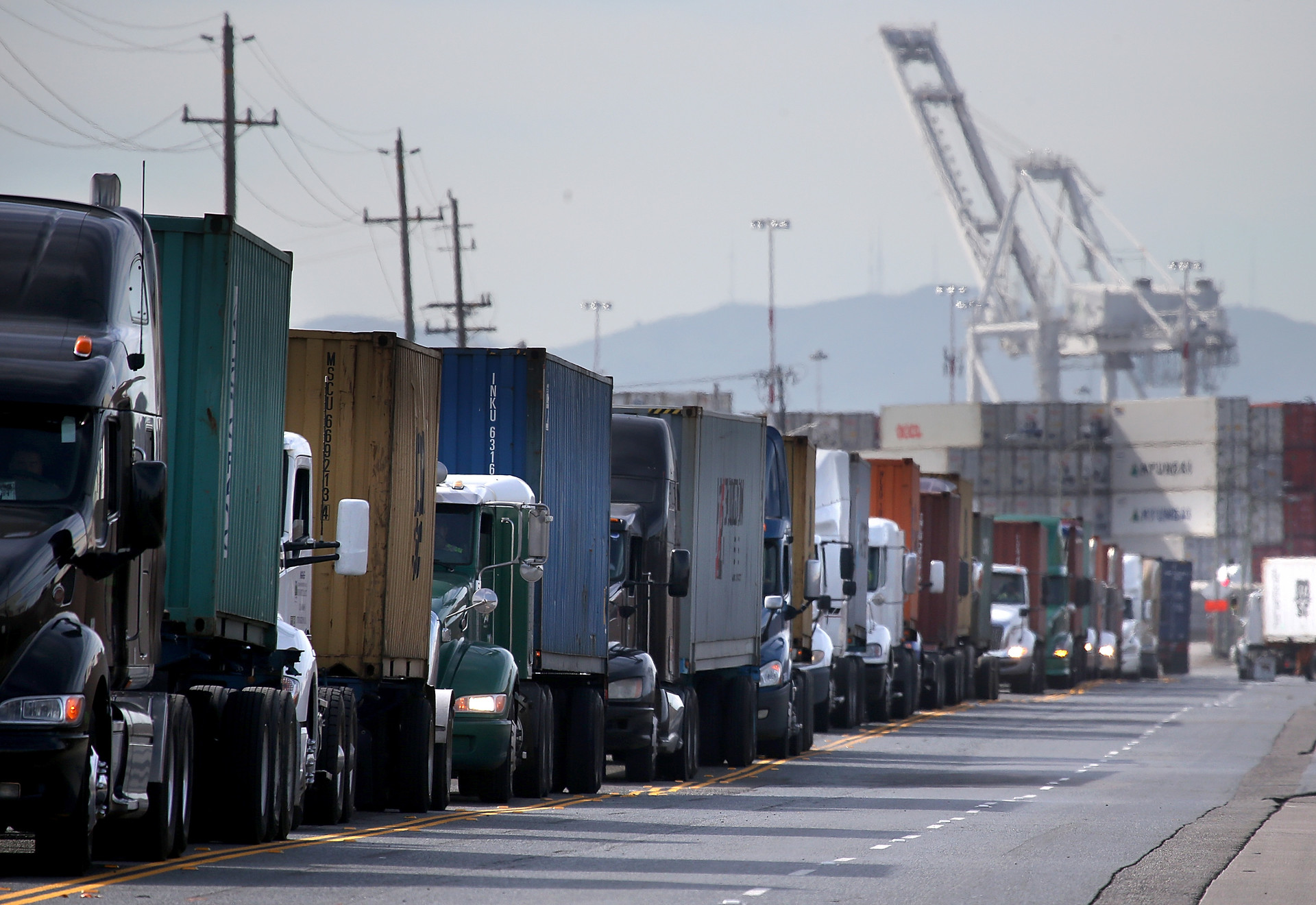
The area is bound by interstate freeways and is home to the third busiest seaport in California. Residents have long noted punishing air pollution and high local asthma rates, which they say are caused in part by diesel fumes belched from trucks driving in and out of the port.
“If you walk by an intersection for [just] a moment, that has unhealthy air, that’s not a huge problem,” said Brian Beveridge, an organizer with the West Oakland Environmental Indicators Project . “Buf if you live there on the corner, you could be experiencing a higher level of exposure most of the time than any regulatory agency recommends.”
So the group recruited local residents to carry around backpacks with small sensors designed by researchers at UC Berkeley’s Intel Labs. The results showed a clear difference between the air quality as detected by the stationary equipment that air regulators use and what residents were breathing in their homes. In 2015, the group partnered with the Environmental Defense Fund and Google, among others, on an even more granular study, mounting air sensors on Google Street View cars that repeatedly drove around the neighborhood over the course of a year. The results showed big differences in air quality block by block across the neighborhood. Several pollution hotspots with heavy truck traffic were filled with concentrations of air pollutants consistently higher than nearby ambient levels, sometimes by more than 50%.
In June 2017, the project published its findings in the journal Environmental Science & Technology.
Sponsored
“If you live on one end of a block, pollution can vary widely from the air quality on the other end of the block,” said Millie Chu Baird, an executive in the Environmental Defense Fund’s Office of the Chief Scientist. “It’s an amazing thing to consider.”