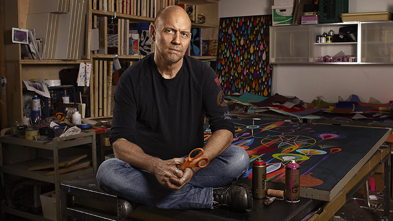
News of San Francisco artist and designer Rex Ray’s death rippled out over the ether Monday afternoon, with many friends and admirers expressing sorrow on social media. Author Rebecca Solnit posted on Facebook about meeting Ray in 1989, and in noting that he designed her first book, wrote, “He made ‘high’ art as well as design and then they merged into something gorgeous and extravagant and joyous and very colorful.” Shortly thereafter a warm tribute to Ray went up on David Bowie’s website, coinciding with a heartfelt post by Griff Williams, owner of Gallery 16 and the artist’s gallerist of nearly 20 years. That Ray’s work so fluidly traverses art and design is a testament to his inestimable talents; that his work is so widely embraced is a testament to him.
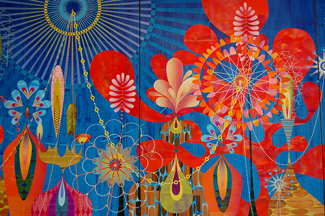
I didn’t know Ray personally, but I would know his work from across the room. I first encountered his collages in 2002 at ModernBook/Gallery494, a gallery-cum-bookstore then located in Palo Alto that featured small exhibitions of highly crafted artworks and art books with a strong design aesthetic. Small works on panel by Ray lined the walls; their lush resin coated surfaces and exquisite color palettes drew me in off the street like a bee to honey, and I wasn’t the only one. I worked at a gallery two doors down and everyone who walked in asked me if I’d seen Ray’s show. The work held broad appeal in Palo Alto, to be sure, where Joseph Eichler’s mid-century modern homes are symbols of good taste and timeless design. Ray’s intricate cut paper collages have always been simultaneously retro and contemporary.
His finely detailed images are often evocative of foliage and often present a bejeweled dreamscape, firmly entrenched in loveliness. Ferris wheels, starbursts and delicate chains make appearances, as do organic forms composed of tear-shaped cut paper petals. Ray’s color combinations are somehow optimistic, or maybe it was his implementation of cutaway shapes, giving practical beauty to the cuttings others might have thrown away. But not Ray — in his work negative space is as essential as positive space, and it speaks volumes about his eye for detail. Coming upon his work now, I look for the “edge events,” small details that give powerful visual impact to the edges of his work. The eye could languish in the center of his compositions quite happily, but Ray also knew to celebrate their boundaries.

Even if the work hinged somehow on being “too beautiful” for some people — we all know the type — his rock ‘n’ roll side could engage anyone. By day, of course, Ray was a graphic designer with a penchant for music. He did corporate gigs and commercial projects for the likes of Apple and Levi’s, including a construction barrier that may have one-upped a lot of public art on display at the time. Early on, he designed posters and T-shirts for ACT UP, and later he created concert posters for just about everyone, including Florence and the Machine, Radiohead, Kanye West, Rihanna, The Rolling Stones, Bryan Adams, Beck, R. E. M., and Paul McCartney, among many others.
Beyond all of that, he experimented with putting his work on everything from posters to note cards, mugs to iPad covers, jigsaw puzzles to decorative trays, and beyond. He illustrated children’s books and calendars — and once even wrapped a Smartcar in his designs for charity. The beauty of covering all the bases, the so-called high and low, is that the work belongs everywhere, from the museum walls to the gift shop to the street. I vividly recall seeing SFMOMA’s gift shop window tricked out a few years ago with a display of Ray’s wares. He also had many museum shows, of course, and reproductions, as fun as they are, are never as amazing as the work is in person, but frankly it was his ability and his willingness to experiment in so many arenas that was a huge part of his appeal.


